Raanko is a leading web design and digital solutions agency in Dubai dedicated to helping businesses succeed online. We create modern, responsive, and high-performance websites designed to attract customers, strengthen your brand, and generate real business growth. Our team focuses on innovation, speed, and user experience to deliver powerful digital solutions that stand out in the competitive online world.
In today’s digital world, your website must look great and perform perfectly on every device. We design responsive websites that automatically adapt to desktops, tablets, and mobile phones to deliver a seamless user experience.
Our web design approach focuses on creating modern, visually appealing, and high-performance websites that help businesses grow online. We combine creativity with technology to build websites that are fast, secure, and optimized for search engines
Responsive design that works on desktop, tablet, and mobile
Modern layouts that reflect your brand identity
User-focused experience that increases engagement and conversions
We believe that a great website is more than just design. It’s a powerful tool that helps you attract customers, build trust, and grow your business online. From the first concept to the final launch, we ensure every detail is carefully crafted to deliver the best results.
Our goal is to create websites that not only look amazing but also perform exceptionally well, helping your business stand out in a competitive digital market
Our Web Design Process
Simple steps to create modern and professional websites.
Consultation
We start by understanding your business goals, target audience, and project requirements to plan the best website strategy.
Wireframe
Our team creates a wireframe layout to structure the website and define the user experience before the design phase.
Final Design
We transform the wireframe into a modern, responsive website design that reflects your brand and delivers a great user experience.
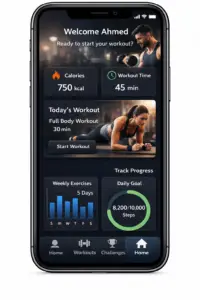
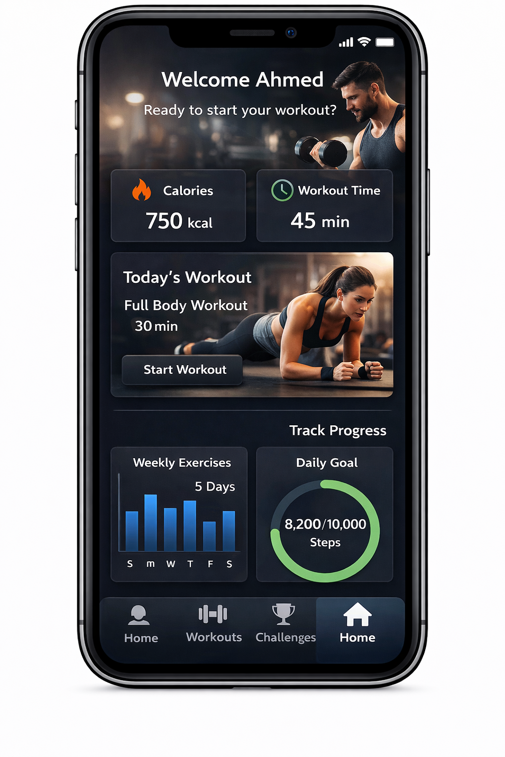
Fitness Mobile App
A modern fitness app designed to help users track workouts and stay healthy.
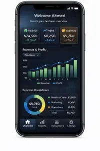
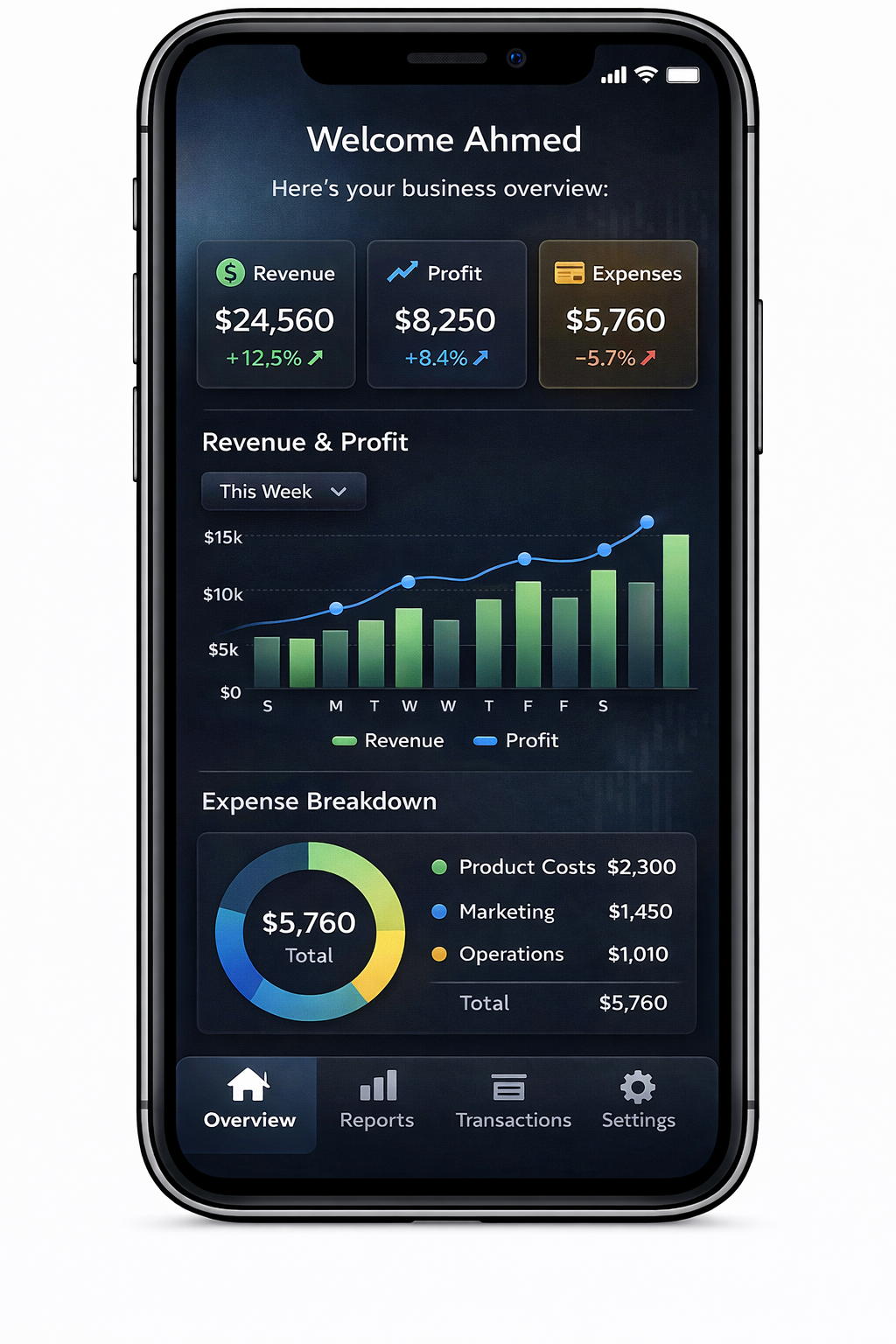
Business Analytics App
A smart dashboard app that helps businesses track data and performance.
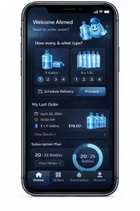
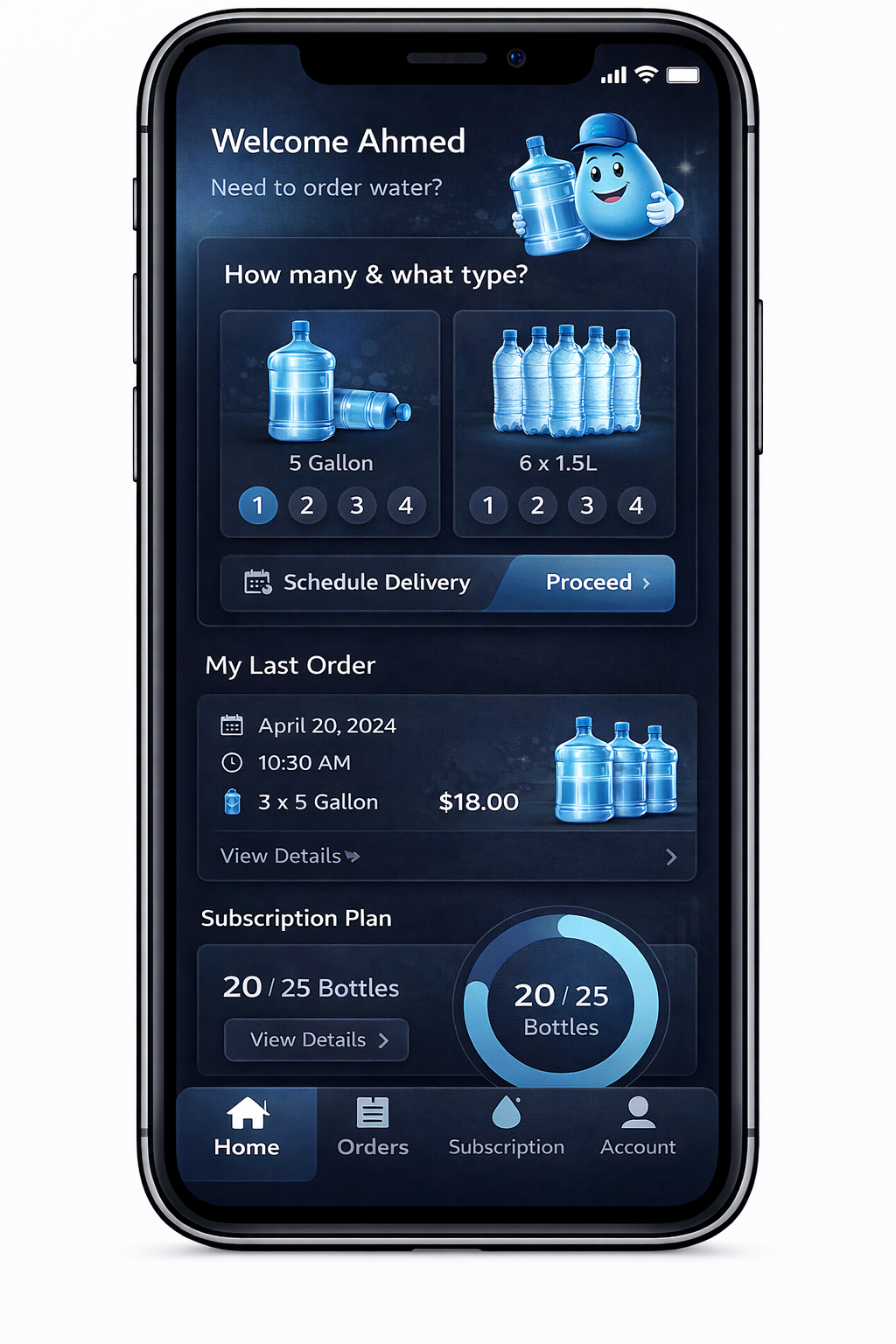
Water Delivery App
A simple mobile app for ordering and managing water delivery services.